


Behind Hanes’ Eyebrow-Raising Makeover with Nick Ball and Special US


BTS Photos: Mau Kuri
Last month, American clothing mainstay Hanes teamed up with agency partner Special US for a fresh wardrobe change; updated branding and a new campaign that channels the apparel brand’s famous comfort into outfits of pure confidence.
‘Get Comfortable’ launched with a refreshed-yet-classic visual identity for Hanes, as well as some stylish, editorial-style photography from Santiago Ruisenor and Emman Montalvan, used in print and OOH placements across New York. However, MJZ director Nick Ball’s four cheeky films, packed with wry humour, rich 35mm visuals and swaggering songs, are what grabbed international audiences by the lapels.
Each spot follows an effortlessly cool character as they harness unshakeable confidence – grocery shopping in underwear, playing pool after being ‘pantsed’ – thanks to Hanes’ comfortable clothing. And not a word needs to be spoken to hammer the point home.
Above: 'Grocery'
“We wanted to create moments that didn't have to explain themselves, and the decision to not have any dialogue helped us get there,” says Special US ECD Kasia Canning, speaking with LBB. “It shows confidence from the brand, that we can let viewers figure things out for themselves without spelling it all out.”
Director Nick aligned with the creatives early on and sought out locations with “enough established texture” to make the aesthetic quickly readable while elevating the everyday “ever so slightly… Which is easier said than done and harder to fake than people think,” he explains.
“We shot on 35mm, which was an absolute treat and, frankly, should be mandatory across the board,” he jokes, discussing the shoot in Mexico with production service company The Lift. “We tried to do too much in the time we were given, which seems to be the defining experience of every job at the moment. Pulling it off required trust and collaboration working from the top down and we were genuinely lucky to have both.
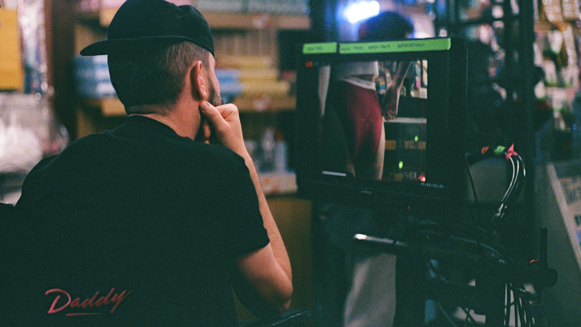
Above: Nick Ball on set
“On the more surreal end of things, apparently having a piñata made in your likeness is completely standard practice in Mexico City. I now own one of myself and it's both flattering and deeply unsettling.”
The creatives and crew worked to balance the films’ humour with the campaign’s look, believing they could “get away with almost any kind of humour” as long as they made stylish decisions, rather than being “jokey”. Kasia shares, “The casting, the music, the pacing, it was all done very elegantly, as if we were talking about something much more serious than underwear.”
The work occasionally toes the line between stylish and risqué – a decision made, says Special US ECD Estefanio Holtz, to make people think about Hanes in a new way. “The work had to raise some eyebrows. [But] we talked a lot about doing everything tastefully, so none of the jokes came across as crass or lowbrow.”
Above: 'Keep Em On'
According to Kelsey Leetzow, senior manager of brand marketing for the Gildan-owned Hanesbrands, the brief explicitly challenged Special US to help Hanes break through in a crowded category, and move beyond its traditional campaign approach.
“We wanted to stay true to Hanes’ heritage and sense of humour, but with an updated boldness and playfulness that would resonate with consumers today. We gave Special the freedom to push our thinking, and they brought back a vision that felt both fresh and unmistakably Hanes.”
With Hanes having spoken about ‘comfort’ since 1900, Special identified that the space had gradually become less ownable, and so looked deeper into what comfort belies. “When you're truly comfortable, you don't care what others think,” says Kasia. “That's the confidence – knowing you feel good, look good, and you're not trying to prove anything to anyone.”
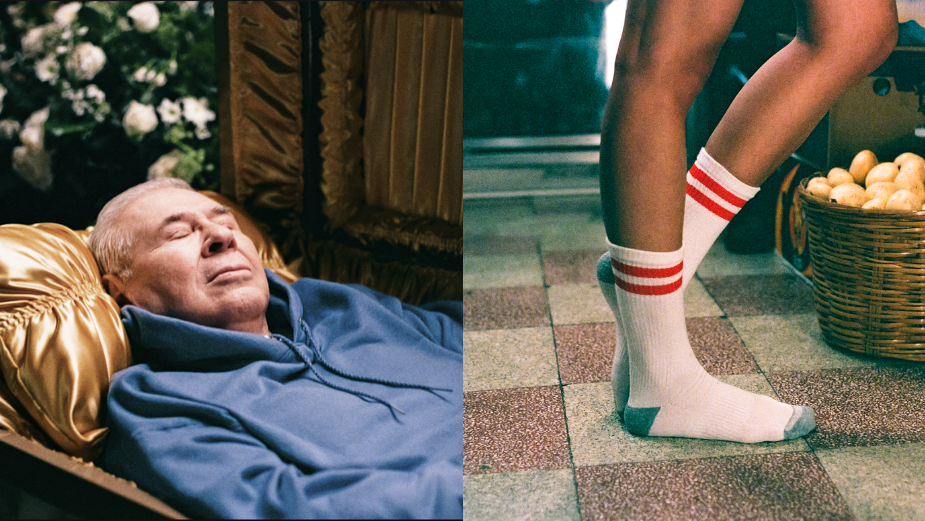
While this is the first major campaign under Kasia and Estefanio’s leadership as Special NY's new ECDs, it’s a familiar agency partnership for Nick Ball, who recently helped Special expand Uber Eats’ creative palate.
“We're on a good run,” he says of the collaboration. “It's a genuinely open, confident, trusting relationship and I think that's rare enough to be worth protecting. I always come in with a strong point of view on the scripts I'm presented, and the whole thing works best when an agency is ready to back that kind of creative evolution rather than manage it to death. They're also just a genuinely great bunch of smart, passionate people who care deeply about the work, which makes the whole thing considerably more enjoyable than it has any right to be.”
Both the Uber Eats and Hanes work have humour at their core, but are “very singular creatures” in most other aspects. “The only constant is that my brain happened to be the one cooking both of them, which either says something interesting about my range or something worrying about my obsessions.
Above: 'Loyalty'
“What connects them is just a confidence around ‘tone’, which is one of those words that gets thrown around constantly in advertising and understood by almost nobody,” Nick continues. “I'm a bit of an assassin for creating something that could only exist for that specific brand, that specific story, that specific moment. It always stems from character and the world you build around them.”
Kelsey commends the finished product’s “playful” photography and “cheeky copy”, which she agrees creates something “that feels confident, modern and unmistakably Hanes”.
“We’ve been building towards this moment for a while. We needed to evolve the way Hanes showed up for a new generation of consumers… in a way that felt fresh and culturally relevant while staying true to what our brand has always stood for. Our new leadership team shared that vision, giving us the confidence to make a bold investment and launch a campaign that signals where the brand is headed.
“I'm also really excited about how flexible the creative system is,” she adds. “It's modular by design, which allows us to adapt and scale it across channels, products and audiences while keeping the work feeling fresh and cohesive.”
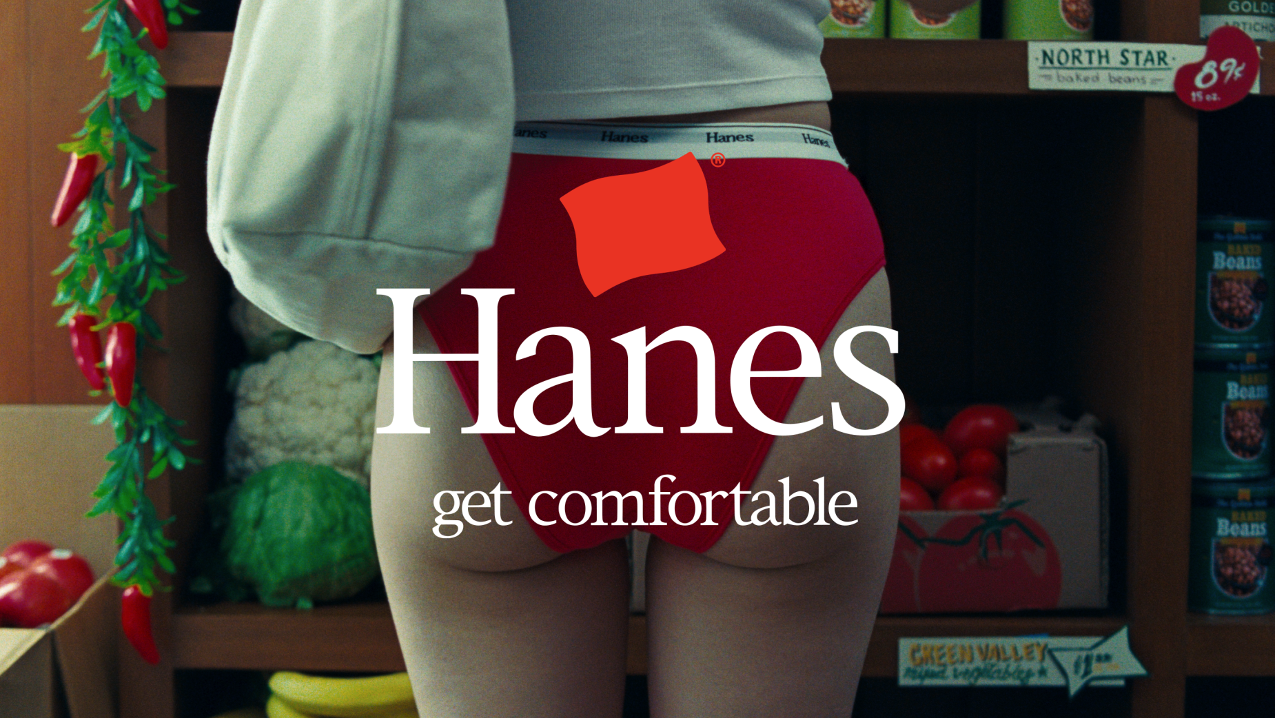
This refers to the visual identity refresh – including new logo – that Special helped create as part of the new campaign. “The logo is such an important part of Hanes’ branding and heritage, [and] we wanted to take a fresh approach throughout the campaign while staying true to its roots,” shares Estefanio. “So, we anchored our wordmark with the flag and added our new ‘Get Comfortable’ tagline in the same typeface. The result is a simple, graphic treatment of our iconic symbol, inspired by its origins and built for the future.”
For Kelsey, the real value of ‘Get Comfortable’ lies within this very flexibility – in terms of its new visuals and branding, as well as its potential as a creative platform going forward. “That gives us a lot of room to evolve the creative while keeping the core idea consistent. Whether we're introducing new products, telling new stories or tapping into cultural moments, the platform can grow with us.
“At its heart, though, it will always serve as both an invitation and a promise,” she concludes, “a reminder that no matter how the campaign evolves, Hanes remains committed to delivering the comfort consumers have trusted for generations.”


