


Purple Creates Community-Based Brand World for the Peel


Purple Creative has refreshed and revitalised the brand world for The Peel, an important, historic and well-respected social charity based in Clerkenwell, London.
The Peel was originally set up in 1898 to improve the lives of those in need within the Clerkenwell community. Still going strong today, they came to Purple – a local neighbour – to create a brand world that was more relevant, meaningful and connected to their vision and values.
“We wanted the new brand world to capture our purpose, personality and better represent our vibrant Clerkenwell community. Our new look has been thoroughly and thoughtfully created, adding a real sense of pride, excitement and togetherness within our organisation. It’s already put us on a more professional path, allowing us to be more impactful and joined up with our fundraising activities. I love that it’s more eye-catching, relevant and connected – it will make a genuine difference to how we present ourselves, how people perceive us and will bring meaning to all our communications moving forward,” said Paddy Radcliffe, CEO, The Peel.
The new look was inspired by The Peel’s past. During in-depth research, Purple became fascinated by the charity’s old annual reports, some of which dated back more than 100 years. In the collection from the 1940s, they discovered drawings by Fougasse, a famous British artist and Punch cartoonist (real name Cyril Bird), that had been drawn exclusively for The Peel. He was particularly famous for his propaganda posters for the Ministry of Information during World War II, including the famous ‘Careless Talk Costs Lives’ series.
“When we delved into The Peel’s archive, we instinctively knew we’d stumbled on the big idea. Springboarding from Fougasse’s hand-drawn aesthetic, the new wordmark is warm, friendly and differentiated, capturing the people-first values at the heart of the charity. We were inspired by the past but have hopefully led The Peel into a new and exciting future,” said Gwyn Edwards, creative director, Purple Creative.
It was important that the visual identity allowed The Peel to create something simple yet differentiated.
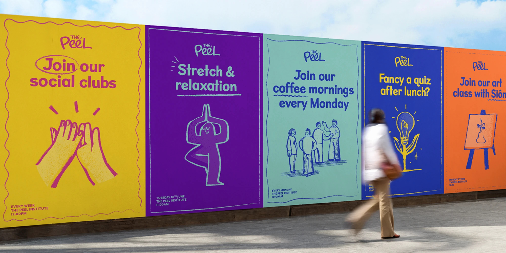
“We extracted and refined each of Fougasse’s hand-drawn letters to give a more contemporary and connected feel, which we think comes together perfectly in the flowing, interconnected Es in the wordmark. The annual reports we found also allowed us to ground the identity in illustration, and we created a range of subjects alongside a suite of expressive marks and borders. These illustrations gave us a unique look but also allows The Peel’s team to roll them out simply and easily across their marketing material,” said Maisie Robertson, designer, Purple Creative.
The refresh involved all aspects of The Peel’s brand world, from logo to letterhead, including a new strapline, ‘The heart of the community since 1898’. Purple introduced a more energetic palette and typography style across the brand world, as well as a human-based photographic style rooted in the people of Clerkenwell. The agency also resurrected Fougasse’s iconic slogan ‘Up The Peel’, using it as a dynamic call to action that can be applied to specific comms and merchandise moving forward.
The Peel’s new identity will go live in January 2026.


