


Pinterest Reveals Its 2026 Colours – And They’re More Vibrant Than Pantone’s


Pinterest has unveiled its colour forecast for 2026, and restraint is officially out. With the release of its annual Pinterest Palette 2026, the platform is formally breaking up with beige minimalism and muted neutrals, replacing it with colours that are vibrant, emotionally charged and unafraid of being seen.
The Palette is built from the searches and saves of Pinterest’s 600+ million monthly active users, translating early intent signals into a practical outlook for brands, retailers and creatives looking to stay ahead of consumer demand. And the tide for 2026 looks unapologetically intense.
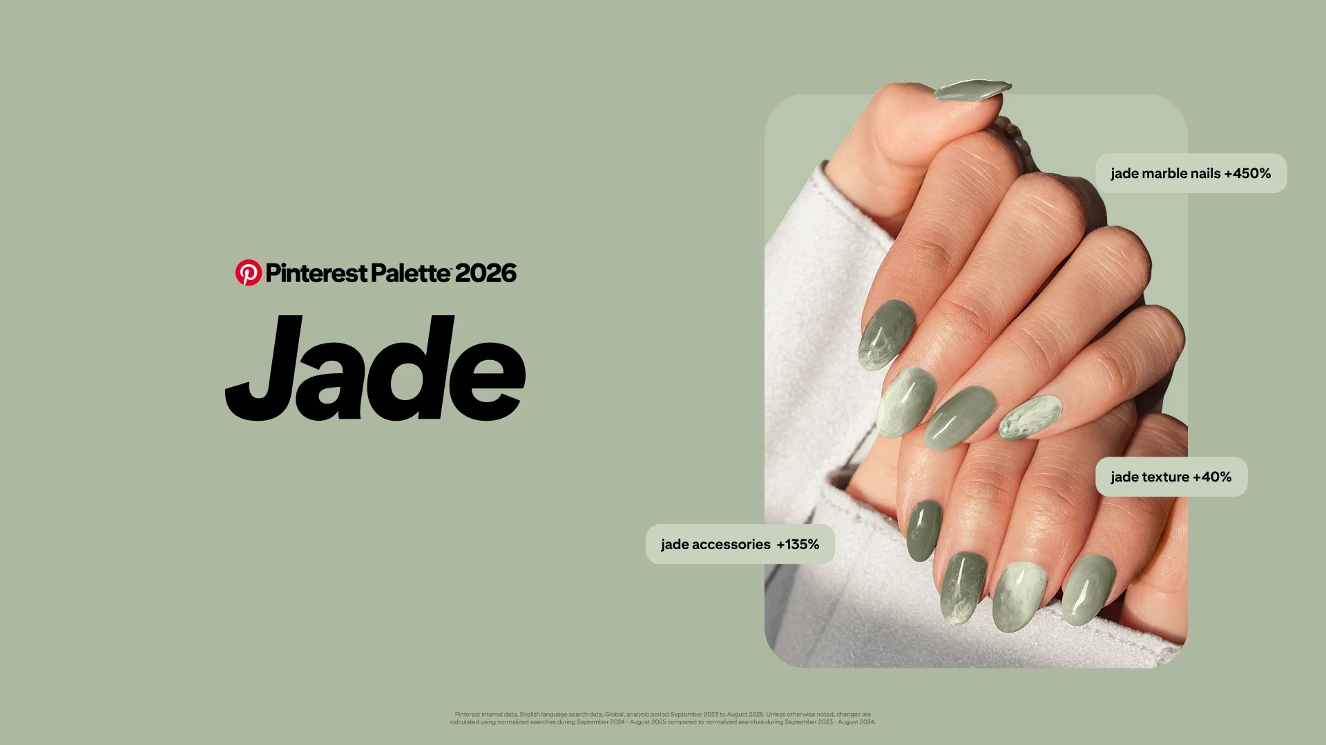
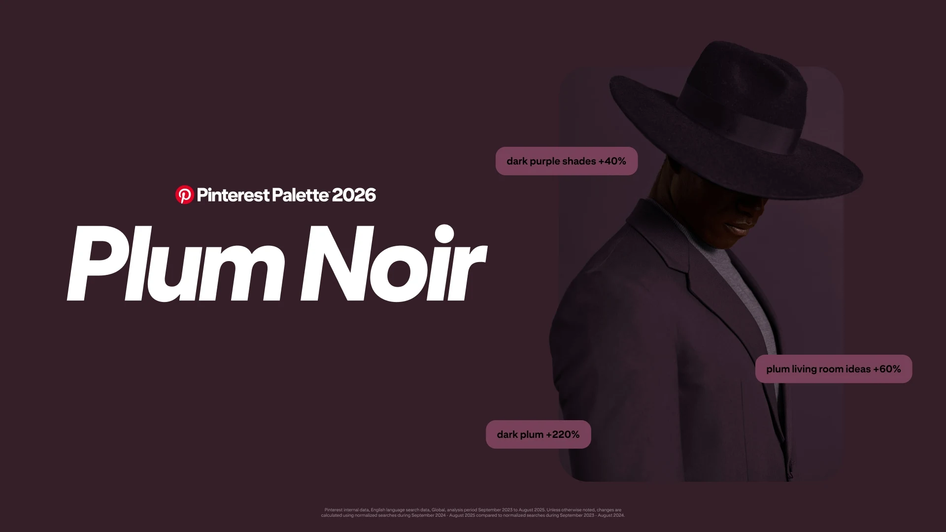
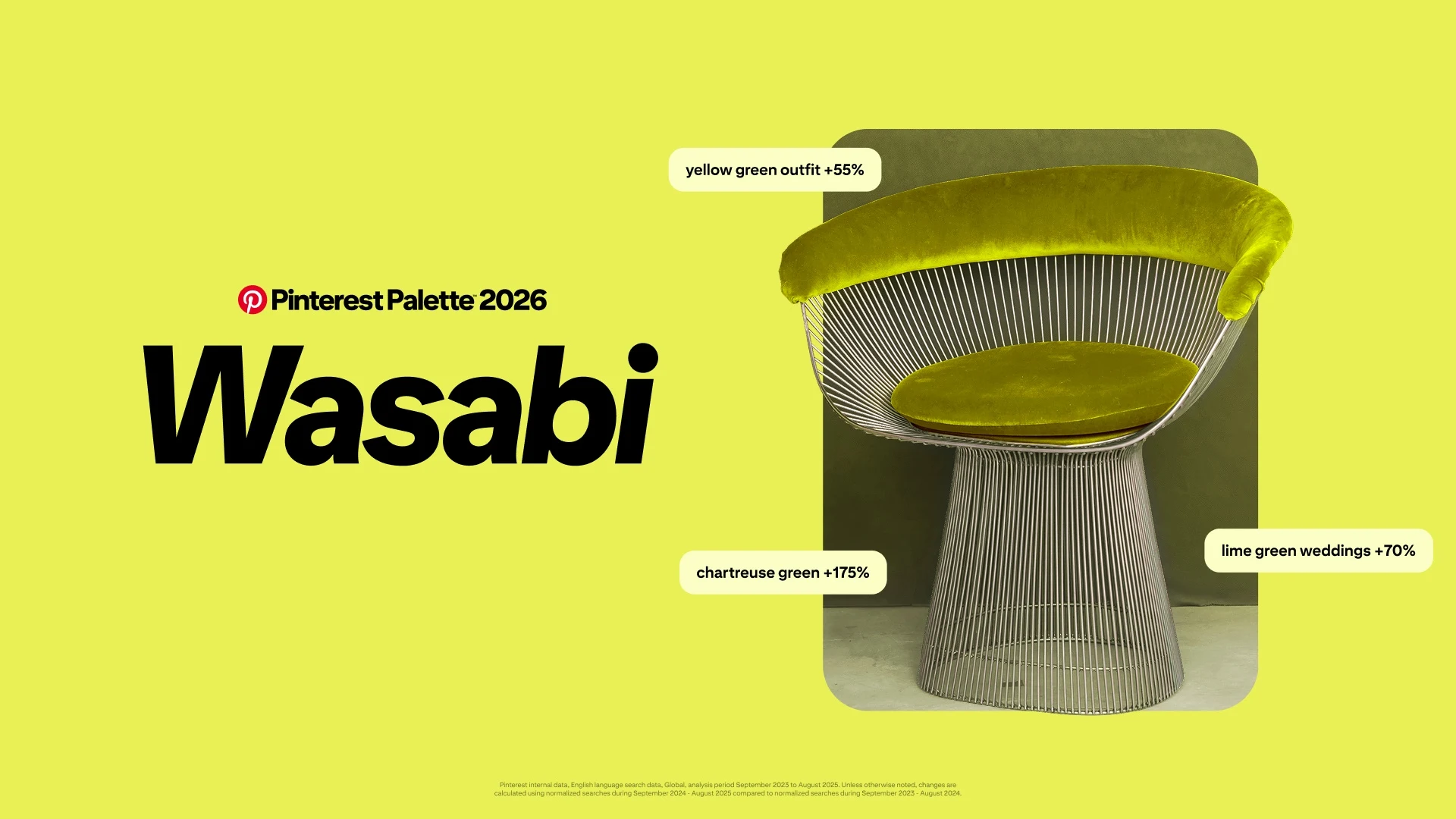
This year’s forecast features five colours expected to shape design, fashion, beauty, interiors and branding decisions over the next 12 to 18 months. They are Cool Blue, Jade, Plum Noir, Wasabi and Persimmon.
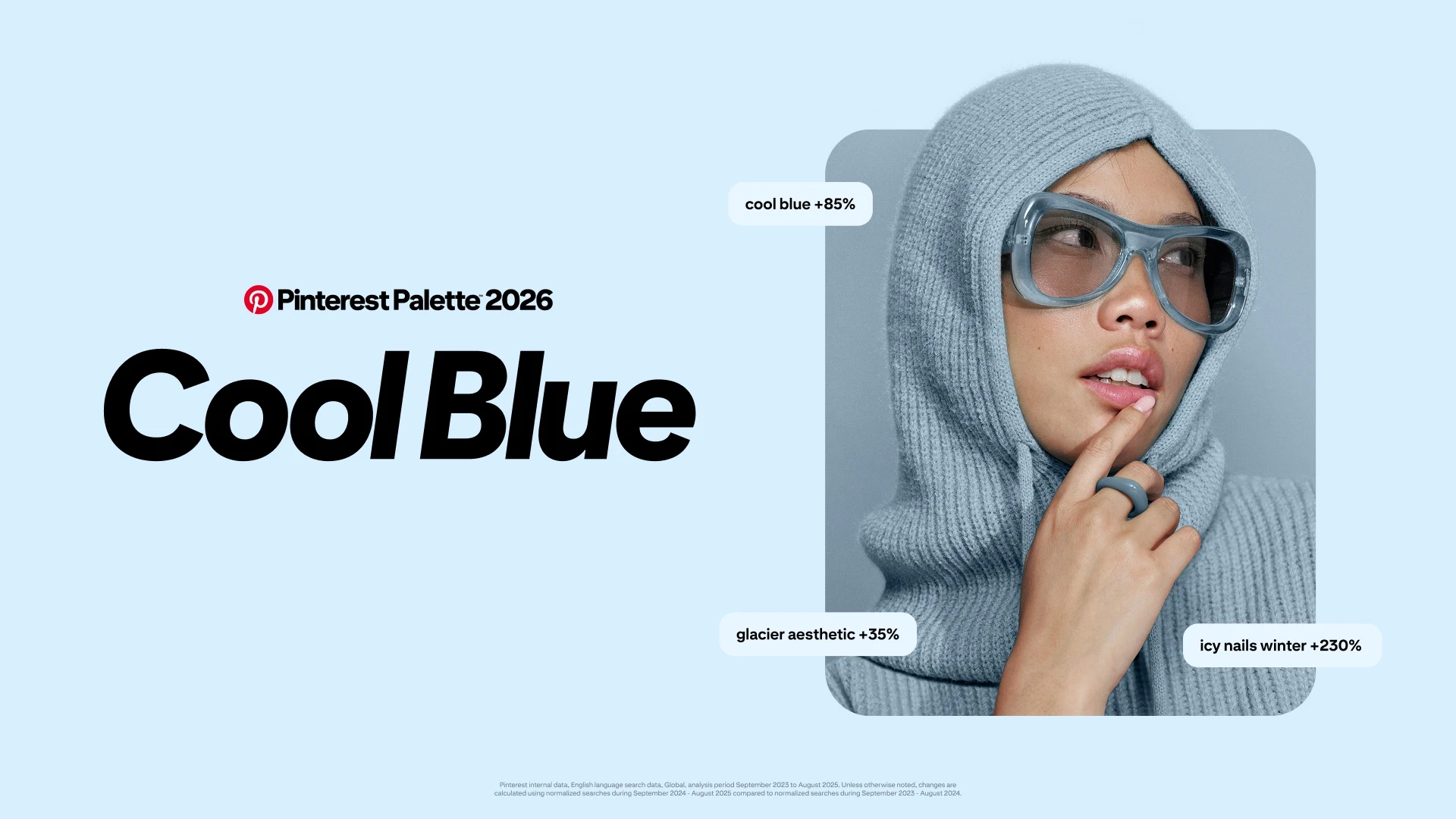
After years dominated by neutrals, these shades act as a visual reset. Cool Blue is clean, sharp and icy, reflecting a wider desire for clarity and focus in culture. Jade taps into the ongoing appeal of fewer, higher quality items, influenced by the ongoing quiet luxury trend. The mineral green colour is sophisticated, neutral and natural.
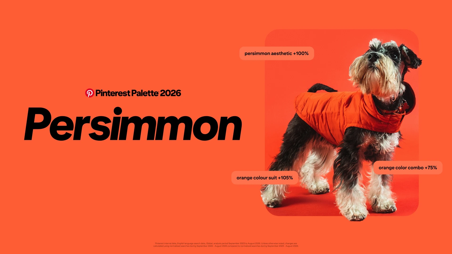
Plum Noir supposedly reflects a growing confidence and desire for self-expression among consumers. The rich purple-burgundy tone is a rejection of youthful pastels, suggesting a desire for depth, boundaries and self-assurance. While Wasabi delivers high-voltage energy, exploding across streetwear, beauty and digital culture, fuelled by gen z’s cyber-Y2K aesthetic and draw towards colours that pop. Persimmon is a fusion of orange and red, and channels optimism, vitality and a nostalgia for ’70s glamour.
According to Pinterest, the unifying thread across the colour palette is emotional utility, a sense that colour can actively do something and act as a balm against a world of increased constant stimulation and ambient chaos. Users are seeking colours that promise to focus them, ground moods or spark joy.
“For a long time, the safest choice was to keep things quiet and neutral. Now people are ready for more,” said Xanthe Wells, VP of global creative at Pinterest. “Pinterest Palette is an invitation to be a little louder with how you feel, to play, to experiment and to let your world reflect the life you actually want to live.”
Of course, there’s a commercial logic for brands leaning into these colours. “Colour is one of the fastest ways consumers signal taste and intent – and one of the smartest levers brands can use to stand out on the shelf and on-screen,” said Caroline Orange-Northey, managing director, UK & Ireland at Pinterest. “Pinterest Palette translates early search and save signals into a practical outlook retailers and marketers can apply to product direction, packaging and campaign creative, helping them stay culturally relevant and drive measurable action in 2026.”
Method-wise, the Palette blends billions of global searches and saves with Pinterest’s visual search technology and expert curation. New for 2026 are the sub-palettes that explore how the colours work together, encouraging brands to think beyond single shades and towards entire aesthetic worlds.
Taken together, Pinterest’s 2026 colours read less like a trend focus and reveal where consumers are attitudinally. And people are ready to turn the volume up. Brands willing to abandon the safety of neutrality may find themselves perfectly synced with where culture is heading next.


