


From Cool Blue to Persimmon: Meet the 2026 Pinterest Palette


The colours ready to inspire your world are here. Pinterest Palette, the annual drop of trending colours, is back with a five-hue line up drawn from the ideas people are searching, saving and exploring on Pinterest. These are the hues shaping creativity, style and demand across culture in the year ahead.
Introducing Cool Blue, Jade, Plum Noir, Wasabi and Persimmon - full‑volume colours that are bold, bright and anything but subtle.
Each hue carries its own energy: the unfiltered joy of Persimmon, the bold defiance of Wasabi, the powerful mystery of Plum Noir. Even the softer tones have presence, from the serenity of Jade to the fresh focus of Cool Blue.
In 2026, people want colour with emotional utility: colours that help them feel grounded in the chaos while staying optimistic about what’s ahead. Amid constant noise and ambient chaos, people are looking for bold, imaginative detours - experiences and aesthetics that spark emotion, offer escape and support a sense of grounded optimism. They are ready for colours that do something for them: reset their mood, sharpen their focus or turn the fun back up. People are choosing how they want to feel and how they want to show up, and using colour to express those choices in their everyday lives.
“For a long time, the safest choice was to keep things quiet and neutral. Now people are ready for more,” said Xanthe Wells, VP of global creative at Pinterest. “Pinterest Palette is an invitation to be a little louder with how you feel - to play, to experiment and to let your world reflect the life you actually want to live.”
Meet the hues defining 2026
Cool Blue
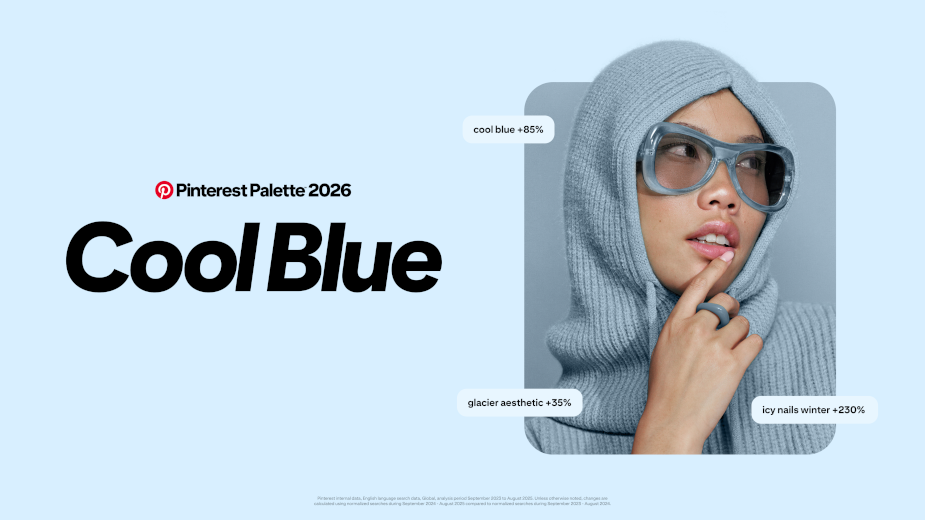
Meet the shade that’s iced out in the nicest way. This frosty hue of blue adds a stone cold chill to everything it touches. It’s a whole subzero mood that’ll warm you right up.
- glacier aesthetic +35%
- cool blue +85%
- icy nails winter +230%
Jade
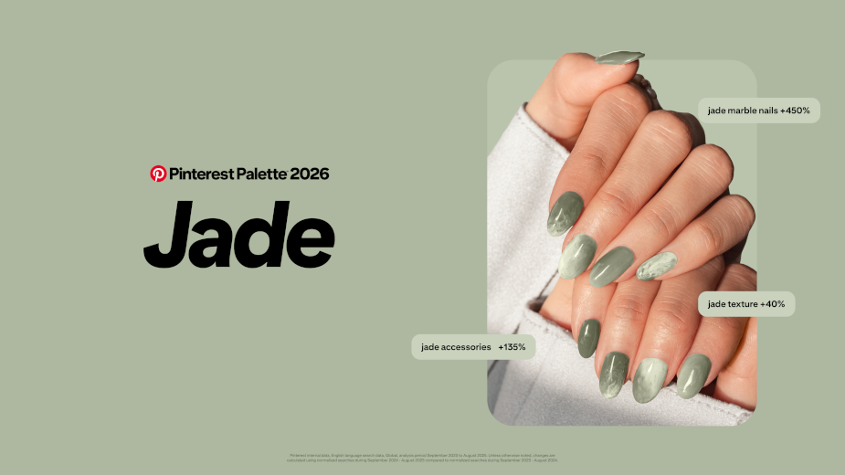
Move over, pistachio. Jade is the moment. Somewhere between mint and moss, this shade of earthy energy blends serenity and sophisticated elegance. It’s the glamorous green of all your dreamscapes.
- jade marble nails +450%
- jade accessories +135%
- jade texture +40%
Plum Noir
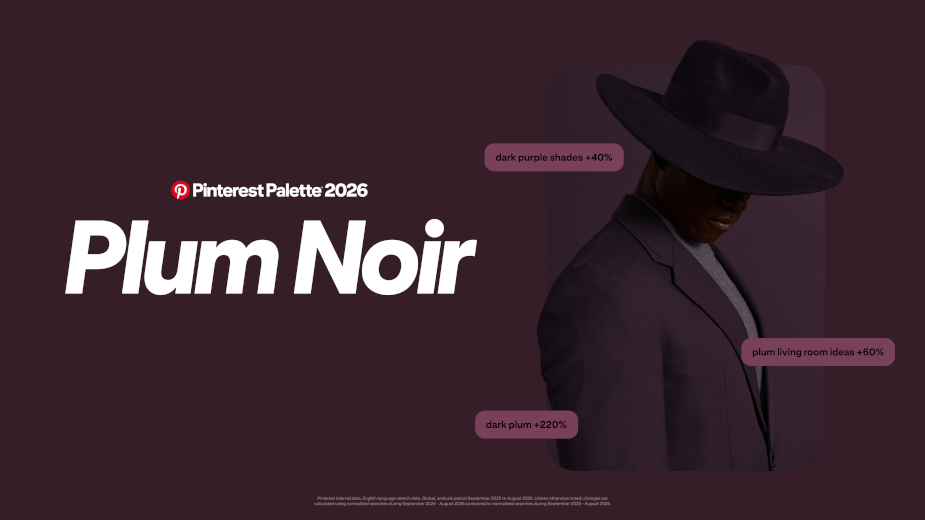
Plum Noir is for the plot. Deep and decadent, this rich, deep purple mixes notes of burnt burgundy with a swirl of velvet brown. Step into your villain era.
- dark plum +220%
- deep burgundy +230%
- dark purple shades +40%
Wasabi
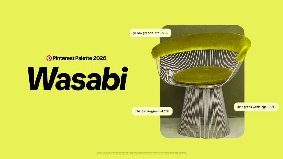
Need a jolt? A healthy dose of Wasabi should do the trick. This electric chartreuse brings a vibrant kick to everything from makeup to mood boards this year. It’s high-voltage energy that can’t be tamed.
- chartreuse green +175%
- lime green weddings +70%
- yellow green outfit +55%
Persimmon
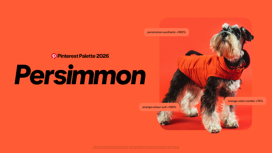
Sweet, sweet heat. Part orange, part red, Persimmon is the feel-good shade making a splash. This colour is a burst of pure joy.
- orange colour suit +105%
- persimmon aesthetic +100%
- orange colour combo +75%
Methodology
Pinterest Palette is inspired by its users. The colour forecasting combines three distinct elements: human behaviour signals, proprietary visual search technology and expert curation.
The team analyses billions of searches and saves from its 600 million users to identify which colours are gaining momentum globally. Pinterest's advanced visual language models decode that visual data at scale, analysing not just individual colours but how they appear together across categories - revealing entire aesthetic worlds people are building on Pinterest. Then, the in‑house colour experts translate these patterns into cultural insights and precise shades.
The result? Five trends‑driven colours expected to define 2026 and inspire real action. New this year: sub-palettes that dial up the vibe. Cool-Wasabi gives chilled chaos. Persimmon-Plum blends mystery with warmth. These shades stand strong alone - and unlock something even richer when paired together.


