


Pantone Immortalises the Grateful Dead in Colour for 60th Anniversary


If you were a colour, what would it be? It’s a question that feels abstract, maybe one you’ve pondered with friends over a drink. Pantone, best known for its matching system, which provides a universal language for colour, has helped musicians answer that very question – developing their own, bespoke, colour.
The Pantone Color Institute is responsible for providing customised colour standards, brand identities, and product colour consulting, as well as trend forecasting, including Pantone Colour of the Year, Fashion Runway Colour Trend Reports, colour psychology, and more.
VP of the Institute Laurie Pressman tells LBB that for some, it is about ensuring consistency of colour across a variety of licensed products; for others, it is about the introduction of a new album or song; and then there are those who just want their own colour to use across many different mediums for that extra stamp of personalisation.
Whatever the reason, it's a deeply personal venture and something the team at Pantone takes seriously. Prince is associated with a distinctive blue-based purple hue (of course) known as Love Symbol #2; the Rolling Stones with ‘Stones Red’ from their tongue and lips logo; and Jimi Hendrix is associated with ‘Ultra Violet’.
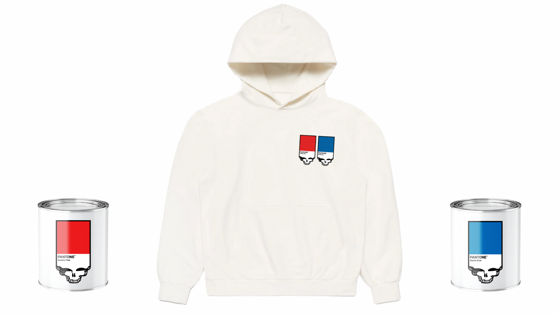
However, this project is Pantone’s first co-branded music merch collection. Rock band the Grateful Dead needs little introduction – in their heyday, they attracted more concertgoers than any other band in history and maintained a cult following, with Deadheads (fanatic followers) being considered more a form of subculture than a fanbase.
Laurie describes the band as “legendary, iconic, and every other adjective one could use to describe their decades-long influence and presence in US culture and music.” She adds, “Though many of the original members of this group are no longer here, their music continues to hold sway over so many, and their legion of Deadheads continues to thrive.”
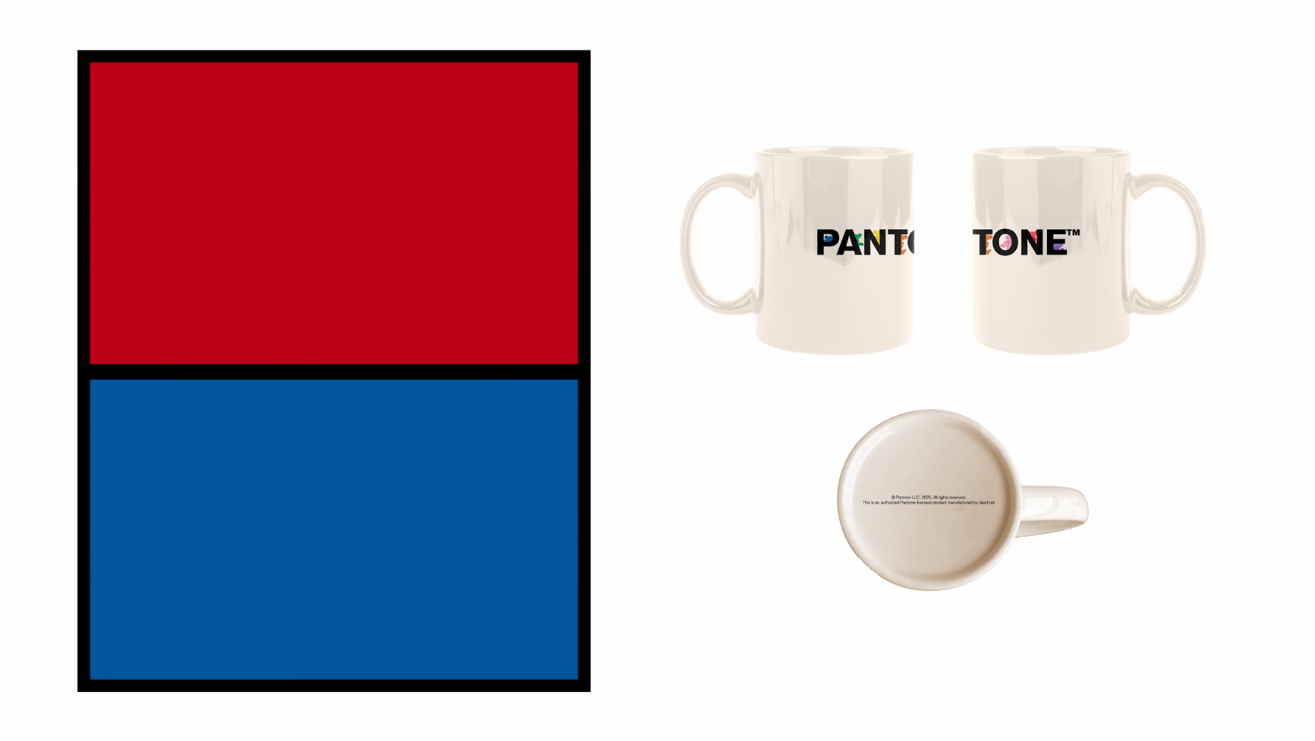
Laurie says the band’s legendary status is how they were able to create ‘Grateful Red’ and ‘Stealie Blue’ – two colours inspired by its signature red and blue shades. The two new colours also pay tribute to the band's 60-year anniversary. “To have such staying power not only speaks to the influence of music and artistic expression but also to the Grateful Dead themselves,” says Laurie. “They are more than just a musical group; they speak to an ethos, a mindset, and a lifestyle, which is why after so many years they still have such a devoted following and their music has such resonance.”
To ensure colour accuracy, Rhino Records, who act as the exclusive licensee for the band’s intellectual property, made the decision to send Pantone an original copy of the album cover of ‘History of the Grateful Dead Vol. 1’ with the original ‘Steal Your Face’ logo in the centre. From there, the team was able to measure and replicate the red and blue from those sections of the logo.
“Rhino Records wanted to standardise these red and blue shades for colour consistency and constancy going forward,” says Laurie. “Defining and developing clear colour standards for each of these iconic shades synonymous with the Grateful Dead for the past 60 years further immortalises their ever-growing legacy.”
While many see Pantone as a behind-the-scenes standard in design, Laurie explains the brand is also “a lifestyle with a very clear colour point of view.” She adds, “We made a foray into the consumer product market with our iconic colour and white trademark look in 2000 with the introduction of our Pantone Universe consumer product line at Conran’s and Galleries Lafayette.”
Since then, the brand has continued to sell consumer products in museums and other design-minded shops, as well as embarking on limited-edition capsule collections with brands who feel they are like-minded.
Pantone recognises how eagle-eyed devout fans can be, but the reaction to the Grateful Dead partnership has been “very strong, which we were very excited to see,” says Laurie.
“Two brands that are iconic came together to memorialise the talent, artistry, and craft of an iconic artist,” she adds. And those are exactly the kinds of conditions Pantone thrives in. “This was such a cool and special moment to be able to show up for our joint fan bases in a way that we can all celebrate together.“
Mark Pinkus, president of Rhino Entertainment, described it as “an honour to see the Grateful Dead officially represented by Pantone.”
We know that colour isn’t static; much like music, it has the tendency to shift in meaning over time, and in projects like this one, Pantone’s job has been to catch it before it fades.
You can find out more about the merch here.


