It’s Never Just a Logo: Why Most Rebrands Miss the Mark

Over this past decade we’ve seen brands accelerate after a rebrand. Old Spice went from ‘your dad’s cologne’ to a cultural icon. Google redefined its visual language for a mobile-first world. Wealthsimple humanised the cold banking category. Mailchimp embraced playful illustration to make tech friendlier. Dunkin’ dropped “Donuts” to stay relevant beyond breakfast. These are the case studies we revisit, and the ones I pin on my Pinterest boards.
And then there’s the other ones we also pin, the ones we remember to learn from. The rebrands that stumbled. We still remember when Tropicana changed their packaging and removed their iconic straw-in-the-orange, and saw their business plummet 20% in two months and left us confused in the aisle.
We all remember when Gap changed their logo, and a week later changed it back to its original design.
We remember Pepsi’s forgettable refresh, (refreshed only 6 times this past decade) in their ambition to redefine themselves for each generation.
There was Jaguar’s transformation that misaligned their brand from its luxury DNA.
And most recently, Cracker Barrel, whose recently simplified, text‐only new logo sparked intense backlash, igniting a national culture war that wiped out over 7% of its stock value almost overnight (and only 6 days later reverted back to its original logo).
So, why do some rebrands ignite growth while others fall flat?
1. They forget the WHY
A rebrand is more than just a new logo and a fresh typeface. Brands fail when they start with aesthetics instead of purpose.
A successful rebrand starts with clarity: Who are we for? Why do we exist? What can we own that our competitors can’t? What emotional space do we own? Your audience won’t care about your new Pantone choice if you can’t tell them why you exist and why it matters to them.
2. They ignore their brands’ DNA
Change for the sake of change is risky. The strongest brands evolve without ghosting their history. Tropicana’s problem wasn’t bad design, it was that they stripped away the thing people recognised in three seconds on a grocery shelf. Change too much, too fast, and you sever the very recognition you’ve built.
3. They design for yesterday, not today
Branding used to move at the pace of print and broadcast. Now it moves at the speed of culture. A brand identity must flex across thousands of touchpoints, apps, AR, TikTok, packaging, retail, events, and feel consistent but alive. Rigid design systems break quickly in a digital-first world.
4. They underestimate execution
A great concept poorly executed is a wasted opportunity. Think of Google’s identity system, every pixel engineered for performance across screens, products, and geographies. Many failed rebrands suffer because rollout is inconsistent, digital touchpoints are clunky, or internal teams don’t adopt the new tools. Rebranding isn’t just design, it’s systems thinking, training, and governance.
5. They forget the people inside
Rebrands live or die on internal alignment. Without a clear brand leadership team to navigate decision-making and build consensus, the work gets diluted. If the people running the brand aren’t on board, it dies in the boardroom before it ever hits the market.
The best agencies know to get internal buy-in early so your CEO, marketing team, and even the front-line staff are living and breathing the new identity.
In the last two years, the stakes have risen. We’re in a digital-first, always-on economy where people expect more, more personalisation, more speed, more meaning, more conscience. Nowadays, a rebrand isn’t a facelift, it’s an entire rewiring of how your brand looks, acts, and connects. The brands that thrive build worlds, not just logos. They start with purpose. They design for emotion. They create systems that can bend and adapt without breaking. And more importantly, they put design at the centre of every decision. And the ones that don’t? They’re the ones we forget.
How ONE23WEST Make Rebrands Work
At ONE23WEST, we’ve learned that a rebrand has to do three things: keep the soul, move with culture, and connect emotionally at every touchpoint.
Saje Natural Wellness was a heritage wellness brand at risk of fading into the ‘granola’ blur. So, we repositioned them around a bold new idea, ‘Remedy Real Life’, and brought it to life with a flexible, campaign-ready system. We didn’t just make it prettier; we made it purposeful, connecting modern discomforts (from Sunday Scaries, to tech neck, and sleepless nights) with centuries-old plant remedies.
The result? Sales up 7%, transactions up 5%, conversion up 3%, proof that design rooted in strategy delivers.

Saje, 2024 rebrand
Then there’s the case of Les Schwab Tires which was iconic but visually adrift. We didn’t reinvent it, we reawakened it. Inspired by 1950s roadside Americana, we revived their unmistakable reds and yellows, introduced custom typography, and built a human-centred design system that feels as right in 2025 as it would have in 1955. It unified hundreds of stores, modernised their presence, and reignited employee pride.
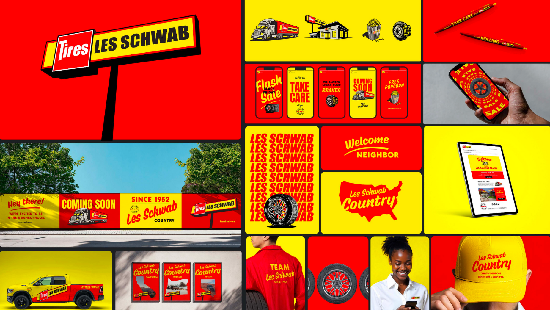
Les Schwab rebrand, 2025
Real Canadian Superstore was often mistaken for Walmart. We shifted them from ‘big box generic’ to a brand that proudly reflects Canada’s cultural diversity. Our platform, ‘Everything for Every Taste’, celebrated Canadian cuisine in all its forms, from perogies to halo-halo, and rolled out in 5 languages across TV, digital, OOH, and in-store. Brand perception improved dramatically, with message clarity, cultural relevance, and intent-to-shop all outperforming industry norms.
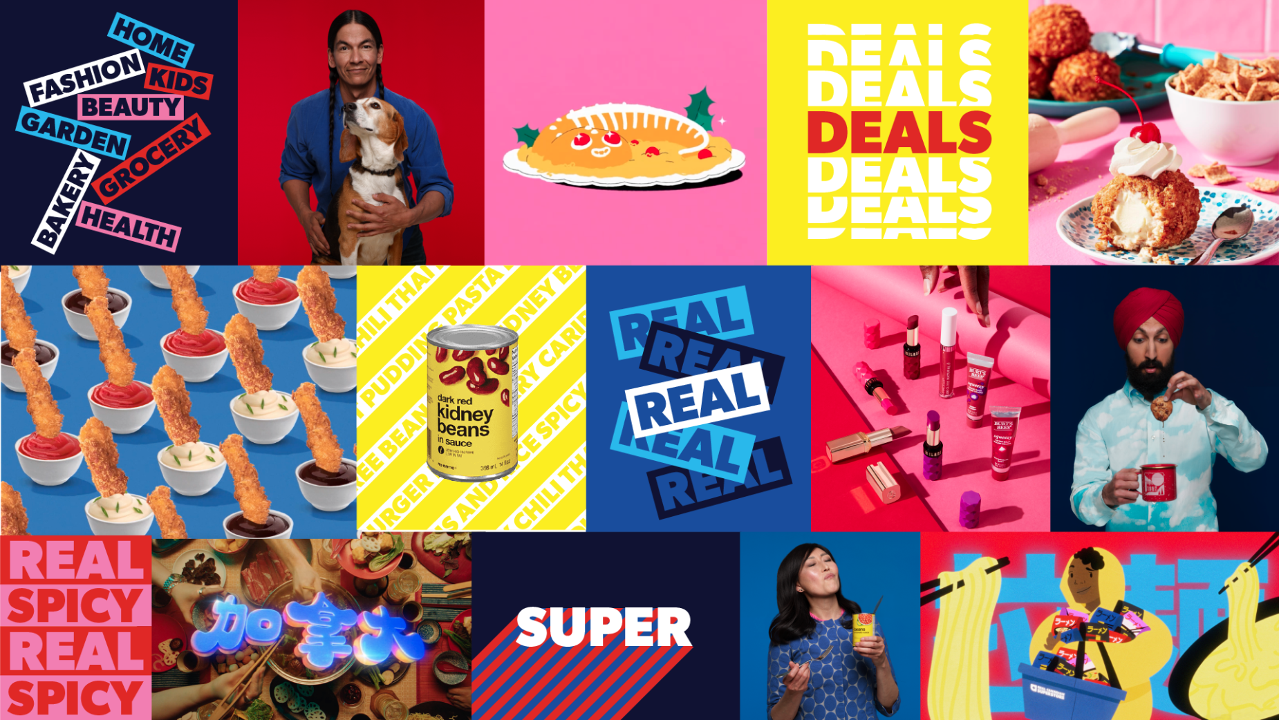
Real Canadian Superstore rebrand, 2022
When it comes to rebrands, it’s important to stay focused on not just needs changing, but also what you are choosing to keep. Honing in on the soul, the story, the spark that made people care in the first place. When you evolve with intent, clarity, and emotional truth, design becomes more than decoration; it becomes direction. This is the key to reinventing brands that want to stay remembered, not just recognised.


