


Domino's Serves Up Mouthwatering Makeover with Shaboozey


Domino's Pizza Inc. has launched its first brand refresh in 13 years, with the goal of making every aspect of the brand as craveable as what's inside the box. The brand took inspiration from its past and present, and transformed it into modernised elements that will better reach current and future pizza lovers. Refreshed elements include hotter, more delicious colours, a bolder typeface and graphics, music that makes you hum along to familiar hits, brighter packaging and even a new name-bending jingle, "Dommmino's," brought to life by the voice of five-time GRAMMY® nominated singer-songwriter Shaboozey. The new look and feel will roll out over the coming months across the US and multiple international markets, with touchpoints including: TV and digital advertising, dominos.com, Domino's ordering app, boxes, print materials, in-store graphics, and team member gear. The bold campaign was created with WorkInProgress.
"Over the past decade, we became known as a technology company that happens to sell pizza," said Kate Trumbull, Domino's executive vice president – global chief marketing officer. "But with our Hungry for MORE strategy, we're bringing the focus back to making and delivering the most delicious products and experience, which is what Domino's customers really want. Rather than launching a more traditional tagline, we're baking craveability right into our name and every aspect of our brand as a reminder of this relentless focus. You literally can't say 'Domino's' without saying 'mmm.'"
Updated Brand Elements
Name-Bending Jingle: Rather than bolting on a tagline like many brands, Domino's has launched a new audio and visual expression of its name, which it calls a "Cravemark," designed to be memorable, fun to mimic, and brought to life by one of the most craveable voices in music today: Shaboozey.
"Pizza is that one food that brings everyone together – different people and generations and cultures – and no one does it better than Domino's," said Shaboozey. "It was a fun challenge to be the voice for the most craveable food."
Brighter Packaging: Perhaps Domino's most important new element is an updated suite of boxes, putting the brand's iconic logo into customers' hands with a simple approach that is designed to be vibrant and instantly recognisable. Domino's signature Handmade Pan and Parmesan Stuffed Crust boxes will also showcase a more premium, indulgent feel with an exclusive black and metallic gold take on its logo.
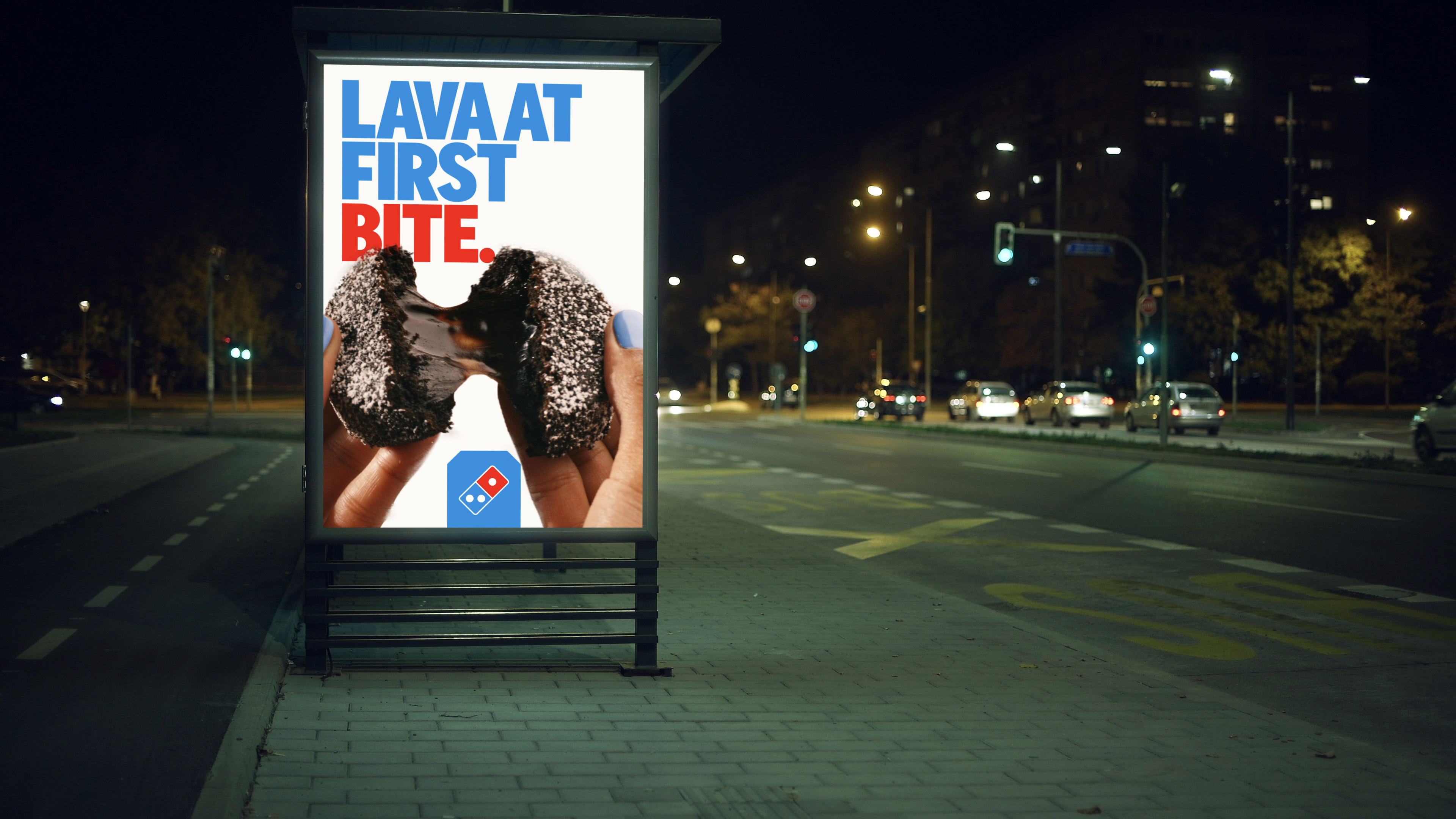
Hotter Colours: Domino's is keeping its iconic red and blue, but evolving them into the hottest version of each, as a nod to the melty heat of a pizza pulled fresh from the oven.
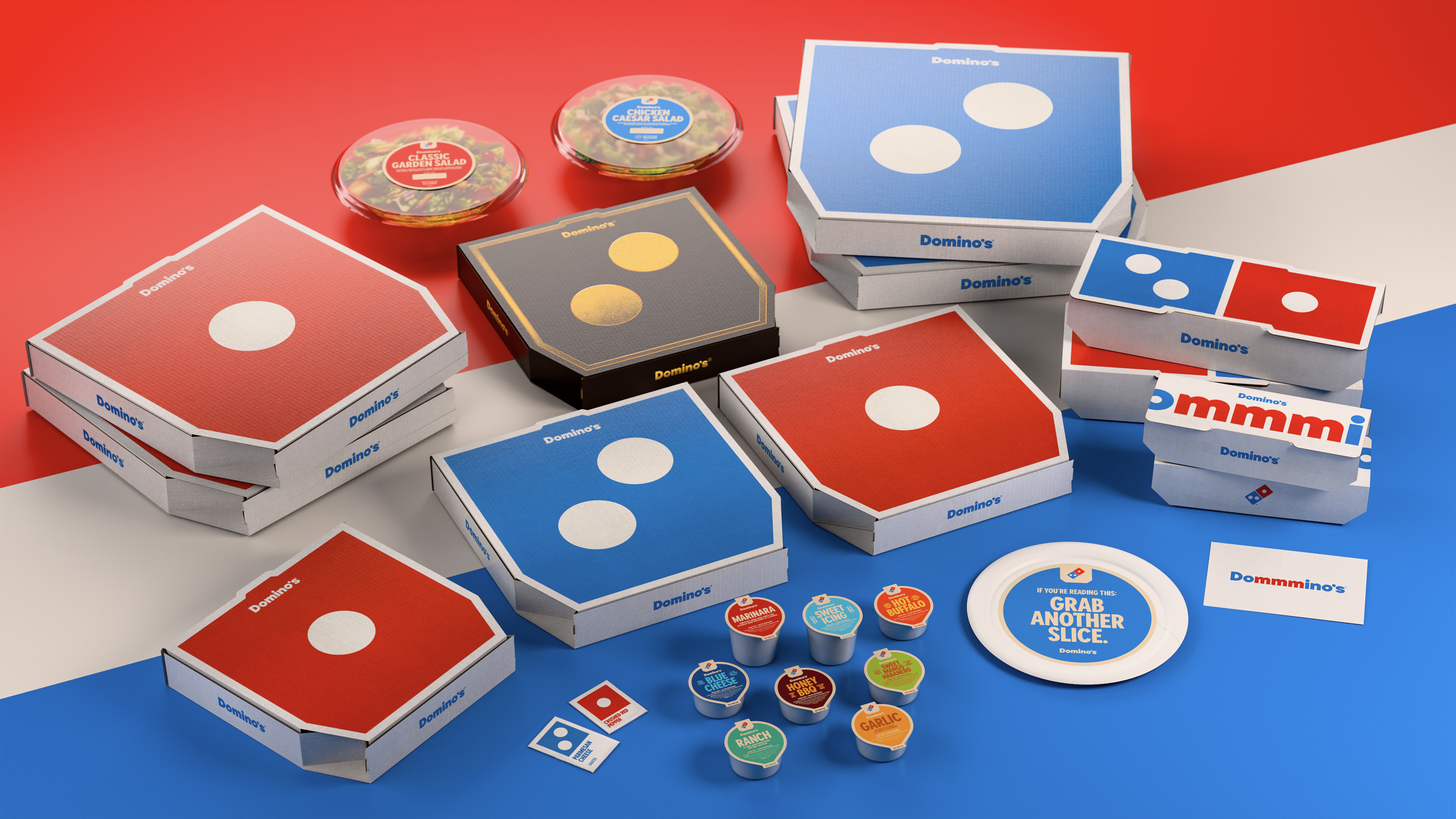
Bolder Font: The brand's new font, "Domino's Sans," will be thicker and doughier, with perfect circles and semi circles in nod to pizza, with lots of personality baked right in!
Additional Updates: The brand refresh also brings vibrancy to dominos.com and the ordering app, with more youthful team member gear, in-store graphics, as well as brighter digital and print materials. The refresh will also help define how Domino's launches bolder menu innovations and more modern consumer-facing elements in the future.
"Most companies rebrand themselves when they're struggling, but after years of category-defying growth, this refresh is about continuing to push to be the best version of ourselves," said Kate. "It's vibrant, it's bold, and it's fun. It's pizza!"


