


Creative Outpost Post It Notes: Joseph Morel


Creative Outpost is an independent post-production studio specialising in VFX, grading and audio. Here, colourist Alex Nerzic and executive producer Charlotte Whittall catch up with director Joseph Morel to discuss snacks, collaborations and must see films for aspiring filmmakers.
Q> Favourite snack in a colour session and why?
Joseph> Black coffee and salt water currently. I’ve been doing this OMAD diet for a few weeks. Water and coffee is all I’m allowed, plus the salt for electrolytes. Got to get the weight loss in before I load up at Christmas!
Q> When you first started thinking about this campaign, what kind of mood or feeling were you aiming for, and how did colour play into that?
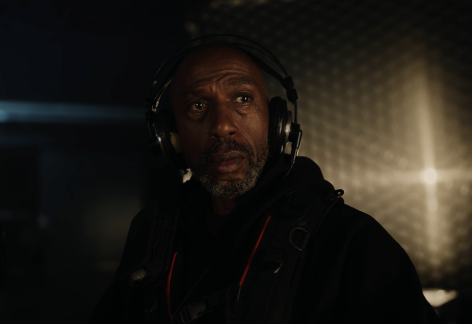
Joseph> I started by listening to a lot of Radiohead and trying to find the tone through that. Once I’d found it (depressing early morning, real but also dreamlike, longing) the colour became much clearer. One of the key things for me was realism in the shadows. I wanted the image to be very high contrast, especially scenes like the bedroom one, where the only source of light is that yellow light from the corridor, with the rest of the bedroom in pitch black.
Q> Were there any particular references, films or images that really set the tone for your approach?
Joseph> Originally I was really inspired by the colour in that Stink ad for British Gas ‘Stop The Silence’. It has a beautiful natural feel whilst also being cinematic at the same time. Me and Alex started there and explored other directions to find what was needed.
Q> How did the filmmaker and colourist collaboration shape the final look; was it more about instinct, back-and-forth, or a bit of both?
Joseph> It’s always hard to know what you want with colour. There are no wrong answers, just different options. We did some quick test grades in radical different directions. One brighter, one really natural, one a bit stylised etc. At the end we had 4-5 options which then informs the option that you want. From there it was just a matter of refinement.
Q> Now that it’s out in the world, what visually stands out to you most about the campaign?
Joseph> I love the balance of light we landed on. Its brave for a commercial. A lot of the image in the bedroom and on-set scene is in black or very dark. But it just works beautifully at honing attention in at where it needs to be, as well as reflecting the reality of stark light in those settings. As pretentious as it sounds, the light and colour of the bedroom scene reminds me of when I had a sleepover as a child at my nan’s house. There was always a sharp yellow light shining in through the crack in the door that was left open. Beautifully nostalgic.
Q> What’s your must-see film for an aspiring filmmaker?
Joseph> 2001: A Space Odessey (1968), Aftersun (2022), Come and See (1985), The Seventh Seal (1957), Harakiri (1962), A Woman Under The Influence (1974), Pink Floyd: The Wall (1979), Threads (1984), Apocalypse Now (1979).
See the campaign here:


